Introduction to Micro Economics
| Site: | mugambi.gnomio.com |
| Course: | mugambi.gnomio.com |
| Book: | Introduction to Micro Economics |
| Printed by: | |
| Date: | Sunday, 15 February 2026, 2:48 AM |
1. Welfare Analysis of Government Policies
Welfare Analysis of Government Policies
2.1 Price Ceiling
In some circumstances, the government believes that the free market equilibrium price is too high. If there is political pressure to act, a government can impose a maximum price, or price ceiling, on a market.
Price Ceiling = A maximum price policy to help consumers.
A price ceiling is imposed to provide relief to consumers from high prices. In food and agriculture, these policies are most often used in low-income nations, where political power is concentrated in urban consumers. If food prices increase, there can be demonstrations and riots to put pressure on the government to impose price ceilings. In the United States, price ceilings were imposed on meat products in the 1970s under President Richard M. Nixon. Price ceilings were also used for natural gas during this period of high inflation. It was believed that the cost of living had increased beyond the ability of family earnings to pay for necessities, and the market interventions were used to make beef, other meat, and natural gas more affordable.
Price ceilings are often imposed on housing prices in US urban areas. Rent control has been a longtime feature in New York City, where rent-controlled apartments continue to have low rental rates relative to the free market rate. The boom in the software industry has increased housing prices and rental rates enormously in the San Francisco Bay Area, Seattle, and the Puget Sound region. Rent control is being considered in both places to make San Francisco and Seattle more affordable for middle-class workers.
2.1.1 Welfare Analysis
Welfare analysis can be used to evaluate the impacts of a price ceiling. In what follows, we will compare a baseline free market scenario to a policy scenario, and compare the benefits and costs of the policy relative to the baseline of free markets and competition. Consider the price ceilings imposed on the natural gas markets. The purpose, or objective, of this policy was to help consumers. We will see that the policy does help some consumers, but makes other consumers worse off. The policy also hurts producers.
This unanticipated outcome is worth restating: price ceilings help some consumers, but hurt other consumers. All producers are made worse off. This outcome is not the intent of policy makers. Economists play an important role in the analysis and communication of policy outcomes to policy makers.
The baseline scenario for all policy analysis is free markets. Figure 2.1 shows the free market equilibrium for the natural gas market. The quantity of natural gas is in trillion cubic feet (tcf) and the price of natural gas in in dollars per million cubic feet (USD/mcf).
Social welfare is maximized by free markets, because the size of the welfare area CS + PS is largest under the free market scenario. As we will see, any government intervention into a market will necessarily reduce the total level of surplus available to consumers and producers. All price and quantity policies will help some individuals and groups, hurt others, and have a net loss to society. Policy makers typically ignore or downplay individuals and groups who are negatively affected by a proposed policy. The two triangles CS and PS are as large as possible in Figure 2.1.
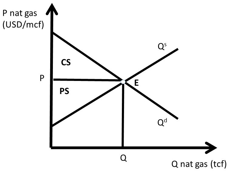
Figure 2.1 Natural Gas Market Baseline Scenario: Free Markets
The price ceiling policy is evaluated in Figure 2.2, where P’ is the price ceiling. Here, the government has passed a law that does not allow natural gas to be bought or sold at any price higher than P’ (P’ < P). For a price ceiling to have an impact, it must be “binding.” This occurs only when the price ceiling is set below the market price (P’ < P). If the price ceiling were set above P (P’ > P), it would have no effect, since the good is bought and sold at the market price, which is below the price ceiling, and legally permissible. Such a law would not be binding on market transactions.
If the price ceiling is set at P’, then the new equilibrium quantity under the price ceiling (Q’) is found at the minimum of quantity demanded (Qd) and quantity supplied (Qs), as in Equation 2.1.
(2.1) Q’ = min(Qs, Qd)
This condition states that the quantity at any nonequilibrium price (P) will be the smallest of production or consumption. At the low price P’, producers decrease quantity supplied, and consumers increase quantity demanded, resulting in Q’ = Qs (Figure 2.2). This is the maximum amount of natural gas placed on the market, although consumers desire a much larger amount.
The first step in the welfare analysis is to assign letters to each area in the price ceiling graph. Next, the letters corresponding to the baseline free market scenario are recorded (initial, or baseline, values have a subscript 0), followed by the surpluses under the price ceiling (ending values have a subscript 1). Finally, the change from free markets to the price policy are calculated to conclude the qualitative analysis of a price ceiling. If the supply and demand curves have numbers (actual data) associated with them, a numerical analysis can be conducted.
The initial, baseline, free market values in the natural gas market at market equilibrium price P are:
CS0 = A + B, and
PS0 = C + D + E.
Social welfare is defined as the total amount of surplus available in the market, CS + PS:
SW0 = A + B + C + D + E.
After the price ceiling is put in place, the price is P’, and the quantity is Q’. New surplus values are found in the same way as under free markets. Consumer surplus is the willingness to pay minus price actually paid, or the area beneath the demand curve and above the price line at the new price P’: (A + C). Producer surplus is the price received minus the cost of production, or the area above the supply curve and below the price line (E):
CS1 = A + C,
PS1= E, and
SW1 = A + C + E.
Recall that social welfare (SW) is equal to the sum of all surpluses available in the market: SW = CS + PS. The welfare analysis outcomes are found by calculating the changes in surplus:
ΔCS = CS1 – CS0 = + C – B
ΔPS = PS1 – PS0 = – C – D
ΔSW = SW1 – SW0 = – B – D
The results are fascinating, since the sign of the change in consumer surplus is ambiguous: the sign of ΔCS depends on the relative magnitude of areas C and B. If demand is elastic, and supply is inelastic, the price ceiling is more likely to yield a positive change in consumer surplus (C > B). The policy makes some consumers better off, and some consumers worse off. The consumers located on the demand curve between the origin (0, 0) and Q’ are made better off by area C, as they purchase natural gas at a lower price (P’ < P). Consumers located on the demand curve between Q’ and Q have a lower willingness to pay than consumers located between the origin and Q’, and are made worse off by the price ceiling (-B) since they are unable to purchase natural gas at the lower price ceiling (P’ <P). The price ceiling created a shortage of natural gas, as natural gas producers reduce the quantity supplied in reaction to the legislated lower price. The decrease in quantity supplied of natural gas makes these consumers unable to buy the good.
Natural gas producers are made unambiguously worse off by the price ceiling: both the price (P) and the quantity (Q) are decreased (P’ < P; Q’ < Q), and the change in producer surplus due to the policy is unambiguously negative (– C – D)
The term deadweight loss (DWL) is used to designate the loss in surplus to the market from government intervention, in this case a price ceiling. Deadweight loss is found by reversing the negative sign on the change in social welfare (–ΔSW):
DWL = –ΔSW = B + D.
The deadweight loss area BD is called the welfare triangle, and is typical for market interventions. Interestingly, and perhaps unexpectedly, all government interventions have deadweight loss to society. Free markets are voluntary, with no coercion. Any price or quantity restriction will necessarily reduce the surplus available to producers and/or consumers in a market.
In current debates over rent control in congested urban areas, economists continue to point out the potential impact of rent control policies: a reduction in affordable housing. These policies are often put in place in spite of economic views, with mixed results. Renters who can find a rent-controlled property win, but many renters are unable to find housing, and must relocated outside the urban center and commute to work from a distant home.
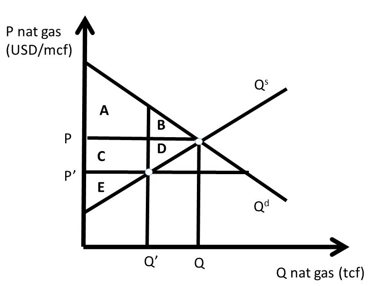
Figure 2.2 A Price Ceiling in the Natural Gas Market
As indicated above, price ceilings on food and agricultural products are most often used in low-income nations, such as in Asia and Sub-Saharan Africa. Price supports for food and agricultural products are most often used in high-income nations such as the US, European Union (EU), Japan, Australia, and Canada.
2.1.2 Quantitative Analysis
In this example, that beef consumers lobby the government to pass a price ceiling on beef products. This happened in the USA in the 1970s, during a period of high inflation. Beef consumers believe that prices are too high and democratically elected officials give their constituents what they want. Suppose that the inverse supply and demand for beef are given by:
(2.1) P = 20 – 2Qd, and
(2.2) P = 4 + 2Qs.
Where P is the price of beef in USD/lb, and Q is the quantity of beef in million lbs. The equilibrium price and quantity of beef can be calculated by setting the inverse supply and demand equations equal to each other to achieve:
Pe = USD 12/lb beef, and
Qe = 4 million lbs beef.
These values, together with the supply and demand functions, allow us to measure the well-being of both consumers and producers before and after the price ceiling policy is implemented (Figure 2.3).
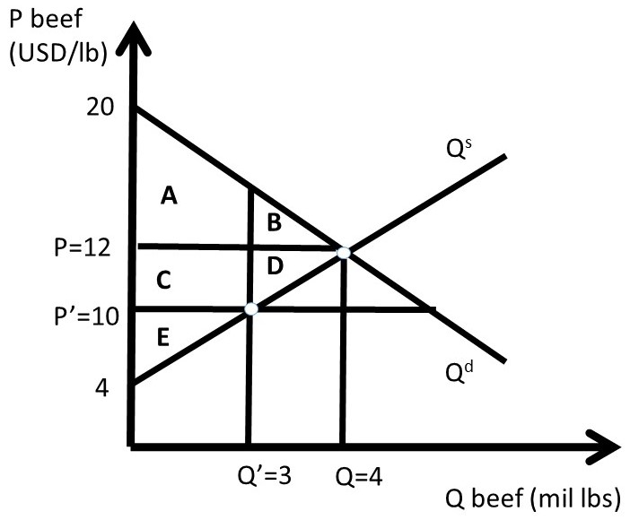
Figure 2.3 A Quantitative Price Ceiling in the Beef Market
The free-market equilibrium levels of CS and PS are designated with the subscript 0, calculated in equations 2.3 and 2.4.
(2.3) CS0 = A + B = 0.5(20 – 12)(4) = 0.5(8)(4) = USD 16 million
(2.4) PS0 = C + D + E = 0.5(12 – 4)(4) = 0.5(8)(4) = USD 16 million
The level of social welfare is the sum of all surplus in the market, as in equation 2.5.
(2.5) SW0 = A + B + C + D + E = 0.5(20 – 4)(4) = 0.5(16)(4) = USD 32 million
Assume that the price ceiling is set by the Government at P’ = 10 USD/lb beef. The quantity is found by finding the minimum of quantity supplied and quantity demanded. In the case of a binding price ceiling (P’ < P), the quantity supplied will be the relevant quantity, since producers will produce only Q’ lbs of beef. Consumers will desire to purchase a much larger amount at P’ < P, but are unable to at the lower price P’, since production falls from Q to Q’. The quantity of Q’ is found by substituting the new price into the inverse supply equation.
(2.6) P = 4 + 2Qs = 10 = 4 + 2Qs therefore, Q’ = 3
The price ceiling (P’) and reduced quantity (Q’) can be seen in Figure 2.3. Next, the levels of CS, PS, and SW are calculated at the price ceiling level. To find the surplus level of area A, split the shape into one triangle and one rectangle by substitution of Q’ = 3 into the inverse demand curve to get P = 14. Area A is equal to: 0.5(20 – 14)3 + (14 – 12)3 = 9 + 6 = 15 million USD. We are now ready to calculate the level of surplus for the price ceiling.
(2.7) CS1 = A + C = 15 + (12 – 10)(3) = 15 + 6 = USD 21 million
(2.8) PS1 = E = 0.5(10 – 4)(3) = 0.5(6)(3) = USD 9 million
(2.9) SW1 = A + C + E = 21 + 9 = USD 30 million
The changes in welfare due to the price ceiling are:
(2.10) ΔCS = CS1 – CS0 = + C – B = 21 – 16 = USD + 5 million
(2.11) ΔPS = PS1 – PS0 = – C – D = 9 – 16 = USD – 7 million
(2.12) ΔSW = SW1 – SW0 = – B – D = 30 – 32 = USD – 2 million
The Dead Weight Loss (DWL) of the price ceiling is the loss to social welfare, of the negative of the change in social welfare:
(2.13) DWL = – ΔSW = 2 USD million.
The quantitative analysis of a price ceiling provides timely, important, and interesting results. First, only a subset of consumers are made better off due to a price ceiling. These consumers win because they pay a lower price for the good under the price ceiling than in the free market (P’ < P). Second, some consumers are made worse off due to the price ceiling, since the quantity of the good available is reduced (Q’ < Q). This is because producers reduce the quantity supplied if the price is lowered (the Law of Supply). Third, all producers of the good are made unambiguously worse off due to the price ceiling, since both price and quantity are reduced (P’ < P; Q’ < Q).
The magnitude of the consumer gains and losses are determined by the elasticities of supply and demand. Elastic demand and inelastic supply provide larger consumer benefits, since area B in Figure 2.3 is relatively small under these conditions. If demand is inelastic and supply is elastic, consumers are less likely to gain from the price ceiling, as area C in Figure 2.3 is relatively small in this case.
1.1. Price Support
Welfare Analysis of Government Policies
2.1 Price Ceiling
In some circumstances, the government believes that the free market equilibrium price is too high. If there is political pressure to act, a government can impose a maximum price, or price ceiling, on a market.
Price Ceiling = A maximum price policy to help consumers.
A price ceiling is imposed to provide relief to consumers from high prices. In food and agriculture, these policies are most often used in low-income nations, where political power is concentrated in urban consumers. If food prices increase, there can be demonstrations and riots to put pressure on the government to impose price ceilings. In the United States, price ceilings were imposed on meat products in the 1970s under President Richard M. Nixon. Price ceilings were also used for natural gas during this period of high inflation. It was believed that the cost of living had increased beyond the ability of family earnings to pay for necessities, and the market interventions were used to make beef, other meat, and natural gas more affordable.
Price ceilings are often imposed on housing prices in US urban areas. Rent control has been a longtime feature in New York City, where rent-controlled apartments continue to have low rental rates relative to the free market rate. The boom in the software industry has increased housing prices and rental rates enormously in the San Francisco Bay Area, Seattle, and the Puget Sound region. Rent control is being considered in both places to make San Francisco and Seattle more affordable for middle-class workers.
2.1.1 Welfare Analysis
Welfare analysis can be used to evaluate the impacts of a price ceiling. In what follows, we will compare a baseline free market scenario to a policy scenario, and compare the benefits and costs of the policy relative to the baseline of free markets and competition. Consider the price ceilings imposed on the natural gas markets. The purpose, or objective, of this policy was to help consumers. We will see that the policy does help some consumers, but makes other consumers worse off. The policy also hurts producers.
This unanticipated outcome is worth restating: price ceilings help some consumers, but hurt other consumers. All producers are made worse off. This outcome is not the intent of policy makers. Economists play an important role in the analysis and communication of policy outcomes to policy makers.
The baseline scenario for all policy analysis is free markets. Figure 2.1 shows the free market equilibrium for the natural gas market. The quantity of natural gas is in trillion cubic feet (tcf) and the price of natural gas in in dollars per million cubic feet (USD/mcf).
Social welfare is maximized by free markets, because the size of the welfare area CS + PS is largest under the free market scenario. As we will see, any government intervention into a market will necessarily reduce the total level of surplus available to consumers and producers. All price and quantity policies will help some individuals and groups, hurt others, and have a net loss to society. Policy makers typically ignore or downplay individuals and groups who are negatively affected by a proposed policy. The two triangles CS and PS are as large as possible in Figure 2.1.
Figure 2.1 Natural Gas Market Baseline Scenario: Free Markets
The price ceiling policy is evaluated in Figure 2.2, where P’ is the price ceiling. Here, the government has passed a law that does not allow natural gas to be bought or sold at any price higher than P’ (P’ < P). For a price ceiling to have an impact, it must be “binding.” This occurs only when the price ceiling is set below the market price (P’ < P). If the price ceiling were set above P (P’ > P), it would have no effect, since the good is bought and sold at the market price, which is below the price ceiling, and legally permissible. Such a law would not be binding on market transactions.
If the price ceiling is set at P’, then the new equilibrium quantity under the price ceiling (Q’) is found at the minimum of quantity demanded (Qd) and quantity supplied (Qs), as in Equation 2.1.
(2.1) Q’ = min(Qs, Qd)
This condition states that the quantity at any nonequilibrium price (P) will be the smallest of production or consumption. At the low price P’, producers decrease quantity supplied, and consumers increase quantity demanded, resulting in Q’ = Qs (Figure 2.2). This is the maximum amount of natural gas placed on the market, although consumers desire a much larger amount.
The first step in the welfare analysis is to assign letters to each area in the price ceiling graph. Next, the letters corresponding to the baseline free market scenario are recorded (initial, or baseline, values have a subscript 0), followed by the surpluses under the price ceiling (ending values have a subscript 1). Finally, the change from free markets to the price policy are calculated to conclude the qualitative analysis of a price ceiling. If the supply and demand curves have numbers (actual data) associated with them, a numerical analysis can be conducted.
The initial, baseline, free market values in the natural gas market at market equilibrium price P are:
CS0 = A + B, and
PS0 = C + D + E.
Social welfare is defined as the total amount of surplus available in the market, CS + PS:
SW0 = A + B + C + D + E.
After the price ceiling is put in place, the price is P’, and the quantity is Q’. New surplus values are found in the same way as under free markets. Consumer surplus is the willingness to pay minus price actually paid, or the area beneath the demand curve and above the price line at the new price P’: (A + C). Producer surplus is the price received minus the cost of production, or the area above the supply curve and below the price line (E):
CS1 = A + C,
PS1= E, and
SW1 = A + C + E.
Recall that social welfare (SW) is equal to the sum of all surpluses available in the market: SW = CS + PS. The welfare analysis outcomes are found by calculating the changes in surplus:
ΔCS = CS1 – CS0 = + C – B
ΔPS = PS1 – PS0 = – C – D
ΔSW = SW1 – SW0 = – B – D
The results are fascinating, since the sign of the change in consumer surplus is ambiguous: the sign of ΔCS depends on the relative magnitude of areas C and B. If demand is elastic, and supply is inelastic, the price ceiling is more likely to yield a positive change in consumer surplus (C > B). The policy makes some consumers better off, and some consumers worse off. The consumers located on the demand curve between the origin (0, 0) and Q’ are made better off by area C, as they purchase natural gas at a lower price (P’ < P). Consumers located on the demand curve between Q’ and Q have a lower willingness to pay than consumers located between the origin and Q’, and are made worse off by the price ceiling (-B) since they are unable to purchase natural gas at the lower price ceiling (P’ <P). The price ceiling created a shortage of natural gas, as natural gas producers reduce the quantity supplied in reaction to the legislated lower price. The decrease in quantity supplied of natural gas makes these consumers unable to buy the good.
Natural gas producers are made unambiguously worse off by the price ceiling: both the price (P) and the quantity (Q) are decreased (P’ < P; Q’ < Q), and the change in producer surplus due to the policy is unambiguously negative (– C – D)
The term deadweight loss (DWL) is used to designate the loss in surplus to the market from government intervention, in this case a price ceiling. Deadweight loss is found by reversing the negative sign on the change in social welfare (–ΔSW):
DWL = –ΔSW = B + D.
The deadweight loss area BD is called the welfare triangle, and is typical for market interventions. Interestingly, and perhaps unexpectedly, all government interventions have deadweight loss to society. Free markets are voluntary, with no coercion. Any price or quantity restriction will necessarily reduce the surplus available to producers and/or consumers in a market.
In current debates over rent control in congested urban areas, economists continue to point out the potential impact of rent control policies: a reduction in affordable housing. These policies are often put in place in spite of economic views, with mixed results. Renters who can find a rent-controlled property win, but many renters are unable to find housing, and must relocated outside the urban center and commute to work from a distant home.
Figure 2.2 A Price Ceiling in the Natural Gas Market
As indicated above, price ceilings on food and agricultural products are most often used in low-income nations, such as in Asia and Sub-Saharan Africa. Price supports for food and agricultural products are most often used in high-income nations such as the US, European Union (EU), Japan, Australia, and Canada.
2.1.2 Quantitative Analysis
In this example, that beef consumers lobby the government to pass a price ceiling on beef products. This happened in the USA in the 1970s, during a period of high inflation. Beef consumers believe that prices are too high and democratically elected officials give their constituents what they want. Suppose that the inverse supply and demand for beef are given by:
(2.1) P = 20 – 2Qd, and
(2.2) P = 4 + 2Qs.
Where P is the price of beef in USD/lb, and Q is the quantity of beef in million lbs. The equilibrium price and quantity of beef can be calculated by setting the inverse supply and demand equations equal to each other to achieve:
Pe = USD 12/lb beef, and
Qe = 4 million lbs beef.
These values, together with the supply and demand functions, allow us to measure the well-being of both consumers and producers before and after the price ceiling policy is implemented (Figure 2.3).
Figure 2.3 A Quantitative Price Ceiling in the Beef Market
The free-market equilibrium levels of CS and PS are designated with the subscript 0, calculated in equations 2.3 and 2.4.
(2.3) CS0 = A + B = 0.5(20 – 12)(4) = 0.5(8)(4) = USD 16 million
(2.4) PS0 = C + D + E = 0.5(12 – 4)(4) = 0.5(8)(4) = USD 16 million
The level of social welfare is the sum of all surplus in the market, as in equation 2.5.
(2.5) SW0 = A + B + C + D + E = 0.5(20 – 4)(4) = 0.5(16)(4) = USD 32 million
Assume that the price ceiling is set by the Government at P’ = 10 USD/lb beef. The quantity is found by finding the minimum of quantity supplied and quantity demanded. In the case of a binding price ceiling (P’ < P), the quantity supplied will be the relevant quantity, since producers will produce only Q’ lbs of beef. Consumers will desire to purchase a much larger amount at P’ < P, but are unable to at the lower price P’, since production falls from Q to Q’. The quantity of Q’ is found by substituting the new price into the inverse supply equation.
(2.6) P = 4 + 2Qs = 10 = 4 + 2Qs therefore, Q’ = 3
The price ceiling (P’) and reduced quantity (Q’) can be seen in Figure 2.3. Next, the levels of CS, PS, and SW are calculated at the price ceiling level. To find the surplus level of area A, split the shape into one triangle and one rectangle by substitution of Q’ = 3 into the inverse demand curve to get P = 14. Area A is equal to: 0.5(20 – 14)3 + (14 – 12)3 = 9 + 6 = 15 million USD. We are now ready to calculate the level of surplus for the price ceiling.
(2.7) CS1 = A + C = 15 + (12 – 10)(3) = 15 + 6 = USD 21 million
(2.8) PS1 = E = 0.5(10 – 4)(3) = 0.5(6)(3) = USD 9 million
(2.9) SW1 = A + C + E = 21 + 9 = USD 30 million
The changes in welfare due to the price ceiling are:
(2.10) ΔCS = CS1 – CS0 = + C – B = 21 – 16 = USD + 5 million
(2.11) ΔPS = PS1 – PS0 = – C – D = 9 – 16 = USD – 7 million
(2.12) ΔSW = SW1 – SW0 = – B – D = 30 – 32 = USD – 2 million
The Dead Weight Loss (DWL) of the price ceiling is the loss to social welfare, of the negative of the change in social welfare:
(2.13) DWL = – ΔSW = 2 USD million.
The quantitative analysis of a price ceiling provides timely, important, and interesting results. First, only a subset of consumers are made better off due to a price ceiling. These consumers win because they pay a lower price for the good under the price ceiling than in the free market (P’ < P). Second, some consumers are made worse off due to the price ceiling, since the quantity of the good available is reduced (Q’ < Q). This is because producers reduce the quantity supplied if the price is lowered (the Law of Supply). Third, all producers of the good are made unambiguously worse off due to the price ceiling, since both price and quantity are reduced (P’ < P; Q’ < Q).
The magnitude of the consumer gains and losses are determined by the elasticities of supply and demand. Elastic demand and inelastic supply provide larger consumer benefits, since area B in Figure 2.3 is relatively small under these conditions. If demand is inelastic and supply is elastic, consumers are less likely to gain from the price ceiling, as area C in Figure 2.3 is relatively small in this case.
1.2. Quantatative Restriction
Quantitative Restriction
Governments in high income nations often subsidize agricultural producers. A price support is one public policy intended to increase producer surplus. The unintended consequence of the price support is a large surplus that is costly to either producers, the government, or both. Another policy intended to help producers is a quantitative restriction, also called output control or supply control. The idea of supply control is to decrease output in order to increase the price. The analysis of elasticity in Chapter One demonstrated that this policy would work only if the demand for the good is inelastic.
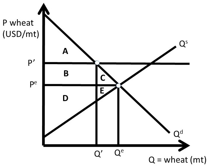
Figure 2.10 Quantitative Restriction in Wheat Market
A quantitative restriction in the wheat market is shown in Figure 2.10. Wheat output is restricted to Q’ < Qe, resulting in a higher price P’ > Pe. The welfare analysis of this policy is identical to that of a price support: if wheat output is reduced by an amount that raises the price to P’, the policy is equivalent to Case One of the Price Support analyzed in the previous section. Therefore, the welfare analysis of the quantitative restriction in Figure 2.10 is:
ΔCS = – B – C,
ΔPS = + B – E,
ΔSW = – C – E, and
DWL = – ΔSW = C + E.
The magnitudes of these welfare changes depend on the elasticities of supply and demand. Note that producers only gain if the demand curve is sufficiently inelastic. If wheat demand is sufficiently inelastic relative to the elasticity of supply, then B > E, and the change in producer surplus is positive. However, if the demand is sufficiently elastic relative to the elasticity of supply, then B < E, and producers lose. This result emphasizes one of the important agricultural policy conclusions of this course: in a global economy, the demand for agricultural goods is elastic due to global competition, and price supports and supply control will hurt producers more than they will help them. This was the result found in Section 1.4.9 above. The welfare analysis of the quantitative restriction highlights this important policy contribution.
The benefit of the quantitative restriction is the lack of a surplus, which is a costly weakness of price supports. One difficulty with supply control is administration and enforcement. Wheat producers will not be free to choose how much wheat that they produce. Instead, the government will allow only a certain amount of wheat produced by each farmer, called a quota. This quantitative restriction can be accomplished through acreage controls also, where wheat producers can only plant a percentage of their total acreage to wheat. This is an imperfect policy, since producers could increase yield per acre on the acres that they are allowed to plant. If the output is restricted, it is difficult to enforce the policy, and if overproduction occurs, it is difficult to remove the surplus.
Although government programs and policies are well intended, they often cause unintended consequences. Price supports and quantitative restrictions can help producers, but at the expense of consumers.
2. Introduction to Economics
1.1.1 Economics is Important and Interesting!
The Economics of food and agriculture is important and interesting! Food and agricultural markets are in the news and on social media every day. Numerous fascinating and complex issues are the subject of this course: food prices, food safety, diet and nutrition, agricultural policy, globalization, immigration, agricultural labor markets, obesity, use of antibiotics and hormones in meat production, hog confinement, and many more. As we work through the course material this semester, please find examples of the economics of food and agriculture in the news. Application of economic principles to food and agricultural issues in real time will enhance the relevance, timeliness, and importance of learning economics.
1.1.2 Scarcity
Economics can be defined as, “the study of choice.” The concept of scarcity is the foundation of economics. Scarcity reflects the human condition: fixed resources and unlimited wants, needs, and desires.
Scarcity = Unlimited wants and needs, together with fixed resources.
Since we have unlimited desires, and only a fixed amount of resources available to meet those desires, we can’t have everything that we want. Thus, scarcity forces us to choose: we can’t have everything. Since scarcity forces us to choose, and economics is the study of choice, scarcity is the fundamental concept of all economics. If there were no scarcity, there would be no need to choose between alternatives, and no economics!
1.1.3 Microeconomics and Macroeconomics
The subject of economics is divided into two major categories: microeconomics and macroeconomics.
Microeconomics = The study of individual decision-making units, such as firms and households.
Macroeconomics = The study of economy-wide aggregates, such as inflation, unemployment, economic growth, and international trade.
This course studies microeconomics, the investigation of firm and household decision making. Our basic assumption is that firms desire to maximize profits, and households seek to maximize utility, also called satisfaction.
1.1.4 Economic Models and Theories
The real world is enormously complex. Think of how complicated your daily life is: just waking up and getting ready for class has a huge number of possible complications! Since our world is complicated, we must simplify the real world to understand it. A Model is a simplified representation of the world, not intended to be realistic.
Model = A theoretical construct, or representation of a system using symbols, such as a flow chart, schematic, or equation.
We frequently use models in physical sciences such as biology, chemistry, and physics. Think of the model of an atom, with the atomic particles: neutron, proton, and electrons. No one has ever seen an atom, but there is significant evidence for this model. It is easy to be critical of economic models, since we are in many cases more familiar with economic events than scientific observations. When we simplify supply and demand into a model, we can think of many oversimplifications and limitations of the theory… the real world is complicated. However, this is how all science works: we must simplify the complex real world in order to understand it.
1.1.4.1 The Scientific Method
Our economic models are built and used following the Scientific Method.
Scientific Method = A body of techniques for investigating phenomena, acquiring new knowledge, or correcting and integrating previous knowledge.
The major characteristic of the scientific method is to use measurable evidence to support or detract from a given model or theory. Following this method, economists will keep a theory as long as evidence backs it up. If the evidence does not support the model, the theory will be modified or replaced. Science, or knowledge, advances in this imperfect manner. To repeat, “We have to simplify the real world in order to understand it.” Science is limited, and the human condition continues to be one of imperfect knowledge, finite lives, and an enduring search for solutions to poverty, pain, and suffering.
1.1.5 Positive Economics and Normative Economics
As social scientists, economists seek to be unbiased and objective in their study of the world. Economists have developed two terms to separate factual statements from value judgments, or opinions.
Positive Economics = Statements that include only factual information, with no value judgments. “What is.”
Normative Economics = Statements that include value judgments, or opinions. “What ought to be.”
In our study of food and agriculture, we will strive to purge our discussions, analysis, and understanding from opinions and value judgments. Our background and experience can make this challenging. For example, a corn producer might say, “The price of corn is higher, which is a good thing.” But, the buyer of the corn, a livestock feedlot operator, might see things differently. All price changes have winners and losers, so economists try to avoid describing price movements in terms of “good” or “bad.”
Economists who study food and agriculture seek to be neutral, unbiased, and professional in their work. This can be challenging at times, when we present our finding and observations to individuals or groups who may not like the outcomes. For example, an economist might be asked to study organic, natural, or local foods and report eh results to farmers and ranchers of conventional food products. Economists could be asked to study and report Chipotle’s impact on the demand for beef, or the profit margins on cage-free eggs. Although some individuals may not like the results of these studies, economists try to be unbiased and objective in reporting their scientific work.
3. Monopoly and Market Power
Market Power Introduction
This chapter will explore firms that have market power, or the ability to set the price of the good that they produce.
Market Power = Ability of a firm to set the price of a good. Also called monopoly power.
A monopoly is defined as a single firm in an industry with no close substitutes. An industry is defined as a group of firms that produce the same good.
Monopoly = A single firm in an industry with no close substitutes.
The phrase, “no close substitutes” is important, since there are many firms that are the sole producer of a good. Consider McDonalds Big Mac hamburgers. McDonalds is the only provider of Big Macs, yet it is not a monopoly because there are many close substitutes available: Burger King Whoppers, for example.
Market power is also called monopoly power. A competitive firm is a “price taker.” Thus, a competitive firm has no ability to change the price of a good. Each competitive firm is small relative to the market, so has no influence on price. On the other hand, firms with market power are also called “price makers.”
Price Taker = A competitive firm with no ability to set the price of a good.
Price Maker = A noncompetitive firm with market power, defined as the ability to set the price of a good.
A monopolist is considered to be a price maker, and can set the price of the product that it sells. However, the monopolist is constrained by consumer willingness and ability to purchase the good, also called demand. For example, suppose that an agricultural chemical firm has a patent for an agricultural chemical used to kill weeds, a herbicide. The patent is a legal restriction that permits the patent holder to be the only seller of the herbicide, as it was invented by the company through their research program. In Figure 3.1, an agricultural chemical firm faces an inverse demand curve equal to: P = 100 – Qd, where P is the price of the agricultural chemical in dollars per ounce (USD/oz), and Qd is the quantity demanded of the chemical in million ounces (m oz).
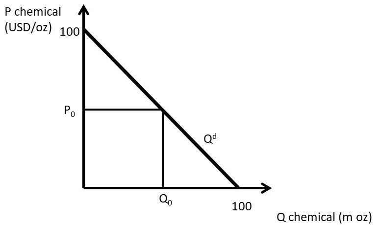
Figure 3.1 Demand Facing a Monopolist: Agricultural Chemical
The monopolist can set a price, but the resulting quantity is determined by the consumers’ willingness to pay, or the demand curve. For example, if the price is set at P0, consumers will purchase Q0. Alternatively, the monopolist could set quantity at Q0, and consumers would be willing to pay P0 for Q0 units of the chemical. Thus, a monopolist has the ability to set any price that it would like to, but with important limitation: the monopolist is constrained by consumer willingness to pay for the product.
3.2 Monopoly Profit-Maximizing Solution
The profit-maximizing solution for the monopolist is found by locating the biggest difference between total revenues (TR) and total costs (TC), as in Equation 3.1.
(3.1) max π = TR – TC
3.1. Monoploy Revenues
Market Power Introduction
This chapter will explore firms that have market power, or the ability to set the price of the good that they produce.
Market Power = Ability of a firm to set the price of a good. Also called monopoly power.
A monopoly is defined as a single firm in an industry with no close substitutes. An industry is defined as a group of firms that produce the same good.
Monopoly = A single firm in an industry with no close substitutes.
The phrase, “no close substitutes” is important, since there are many firms that are the sole producer of a good. Consider McDonalds Big Mac hamburgers. McDonalds is the only provider of Big Macs, yet it is not a monopoly because there are many close substitutes available: Burger King Whoppers, for example.
Market power is also called monopoly power. A competitive firm is a “price taker.” Thus, a competitive firm has no ability to change the price of a good. Each competitive firm is small relative to the market, so has no influence on price. On the other hand, firms with market power are also called “price makers.”
Price Taker = A competitive firm with no ability to set the price of a good.
Price Maker = A noncompetitive firm with market power, defined as the ability to set the price of a good.
A monopolist is considered to be a price maker, and can set the price of the product that it sells. However, the monopolist is constrained by consumer willingness and ability to purchase the good, also called demand. For example, suppose that an agricultural chemical firm has a patent for an agricultural chemical used to kill weeds, a herbicide. The patent is a legal restriction that permits the patent holder to be the only seller of the herbicide, as it was invented by the company through their research program. In Figure 3.1, an agricultural chemical firm faces an inverse demand curve equal to: P = 100 – Qd, where P is the price of the agricultural chemical in dollars per ounce (USD/oz), and Qd is the quantity demanded of the chemical in million ounces (m oz).
Figure 3.1 Demand Facing a Monopolist: Agricultural Chemical
The monopolist can set a price, but the resulting quantity is determined by the consumers’ willingness to pay, or the demand curve. For example, if the price is set at P0, consumers will purchase Q0. Alternatively, the monopolist could set quantity at Q0, and consumers would be willing to pay P0 for Q0 units of the chemical. Thus, a monopolist has the ability to set any price that it would like to, but with important limitation: the monopolist is constrained by consumer willingness to pay for the product.
3.2 Monopoly Profit-Maximizing Solution
The profit-maximizing solution for the monopolist is found by locating the biggest difference between total revenues (TR) and total costs (TC), as in Equation 3.1.
(3.1) max π = TR – TC
3.2. Monopoly Characteristics
Monopoly Characteristics
3.4.1 The Absence of a Supply Curve for a Monopolist
There is no supply curve for a monopolist. This differs from a competitive industry, where there is a one-to-one correspondence between price (P) and quantity supplied (Qs). For a monopoly, the price depends on the shape of the demand curve, as shown in Figure 3.11. A mathematical “function” is defined as a one-to-one correspondence between each point in the range (x) and the domain . A supply curve, then, requires a single price (P) for each quantity (Q). This graph shows that there is more than one price associated with each quantity. At quantity Q0, for demand curve D1, the monopolist maximizes profits by setting MR1 = MC, which results in price P1. However, for demand curve D2, the monopolist would set MR2=MC, and charge a lower price, P2. Since there is more than one price associated with a single quantity (Q0), there is no one-to-one correspondence between price and quantity supplied, and no supply curve for a monopolist.
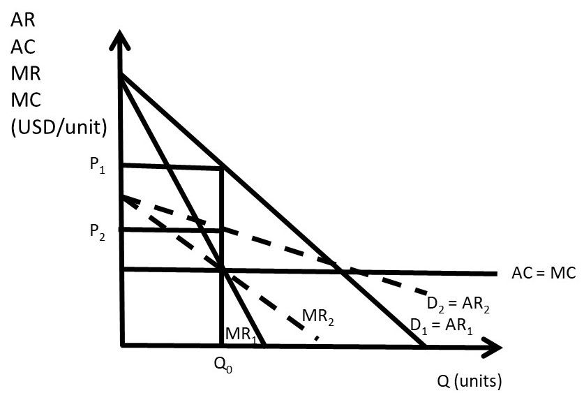
Figure 3.11 Absence of a Supply Curve for a Monopolist
3.4.2 The Effect of a Tax on a Monopolist’s Price
In a competitive industry, a tax results in an increase in price that is based on the incidence of the tax. The price increase is a fraction of the tax, less than the tax amount. The tax incidence depends on the magnitude of the elasticities of supply and demand. In a monopoly, it is possible that the price increase from a tax is greater than the tax itself, as shown in Figure 3.12. This is an interesting and nonintuitive result!
Before the tax, the monopolist sets MR = MC at Q0, and sets price at P0. After the tax is imposed, the marginal costs increase to C + t. The monopolist sets MR = MC = C + t, produces quantity Q1, and charges price P1. The increase in price (P1 – P0) is larger than the tax rate (t), the vertical distance between the C + t and MC lines. In this case, consumers of the monopoly good are paying more than 100 percent of the tax rate. This is because of the shape of the demand curve: it is profitable for the monopoly to reduce quantity produced to increase the price.
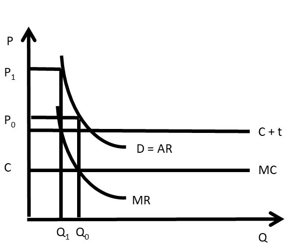
Figure 3.12 The Effect of a Tax on a Monopolist’s Price
3.4.3 Multiplant Monopolist
Suppose that a monopoly has two or more plants (factories). How does the monopolist determine how much output should be produced at each plant? Profit-maximization suggests two guidelines for the multiplant monopolist. Suppose that the monopolist operates n plants.
(1) Set MC equal across all plants: MC1 = MC2 = … =MCn, and
(2) Set MR = MC in all plants.
A mathematical model of a multiplant monopolist demonstrates profit-maximization. The result is interesting and important, as it shows that multiplant firms will not always close older, less efficient plants. This is true even if the older plants have higher production costs than newer, more efficient plants.
Suppose that a monopolist has two plants, and total output (QT) is the sum of output produced in plant 1 (Q1) and plant 2 (Q2).
(3.6) Q1 + Q2 = QT
The profit-maximizing model for the two-plant monopolist yields the solution. The costs of producing output in each plant differ. Assume that the old plant (plant 1) is less efficient than the new plant (plant 2): C1 > C2.
max π = TR – TC
= P(QT)QT – C1(Q1) – C2(Q2)
∂π/∂Q1 = ∂TR/∂Q1 – C1’(Q1) = 0
∂π/∂Q2 = ∂TR/∂Q2 – C2’(Q2) = 0
The profit-maximizing solution is:
(3.7) MR = MC1 = MC2
The multiplant monopolist solution is shown in Figure 3.13. The marginal cost curve for plant 1 is higher than the marginal cost curve for plant 2, reflecting the older, less efficient plant. Rather than shutting the less efficient plant down, the monopolist should produce some output in each plant, and set the MC of each plant equal to MR, as shown in the graph. Let MCT be the total (sum) of the marginal cost curves: MT = MC1 + MC2. The profit maximizing quantity (QT) is found by setting MR equal to MCT. At the profit maximizing quantity (QT), the monopolist sets price equal to P, found by plugging QT into the consumers’ willingness to pay, or the demand curve (D).
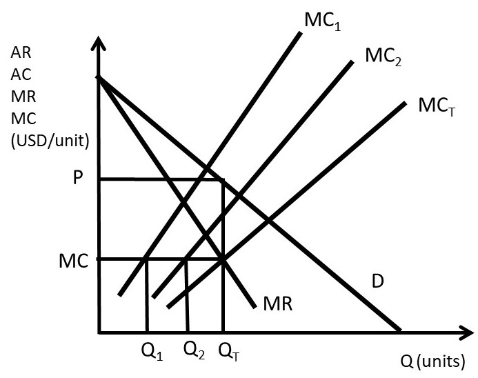
Figure 3.13 Multiplant Monopolist
To find the quantity to produce in each plant, the firm sets MC1 = MC2 = MCT to find the profit-maximizing level of output in each plant: Q1 and Q2. The outcome of the multiplant monopolist yields useful conclusions for any firm: continue using any input, plant, or resource until marginal costs equal marginal revenues. Less efficient resources can be usefully employed, even if more efficient resources are available. The next section will explore the determinants and measurement of monopoly power, also called market power.
3.5 Monopoly Power
In this section, the determinants and measurement of monopoly power are examined.
3.5.1 The Lerner Index of Monopoly Power
Economists use the Lerner Index to measure monopoly power, also called market power. The index is the percent markup of price over marginal cost.
(3.8) L = (P – MC)/P
The Lerner Index is a positive number (L ≥ 0), increasing in the amount of market power. A perfectly competitive firm has a Lerner Index equal to zero (L = 0), since price is equal to marginal cost (P = MC). A monopolist will have a Lerner Index greater than zero, and the index will be determined by the amount of market power that the firm has. A larger Lerner Index indicates more market power. In Section 3.3.3, a Pricing Rule was derived: (P – MC)/P = – 1/Ed, where Ed is the price elasticity of demand. Substitution of this pricing rule into the definition of the Lerner Index provides the relationship between the percent markup and the price elasticity of demand.
(3.9) L = (P – MC)/P = – 1/Ed
An example of a Lerner Index might be Big Macs. There are substitutes available for Big Macs, so if the price increases, consumers can buy a competing brand such as Whoppers. In the case of a good with close substitutes, the price elasticity of demand is larger (more elastic), causing the percent markup to be smaller: the Lerner Index is relatively small. A monopoly is defined as a single seller in an industry with no close substitutes. Therefore, a monopoly that produces a good with no close substitutes would have a higher Lerner Index.
A second pricing rule can be derived from equation (3.9), if we assume that the firm maximizes profits (MR = MC). In that case, the relationship between price and marginal revenue is equal to: MR = P(1 + 1/Ed). If profit-maximization (MR = MC) is assumed, then:
(3.10) MC = P(1 + 1/Ed)
Rearranging:
(3.11) P = MC/(1 + 1/Ed)
This is a useful equation, as it relates price to marginal cost. For example, a perfectly competitive firm has a perfectly elastic demand curve (Ed = negative infinity). Substitution of this elasticity into the pricing rule yields P = MC. For a monopoly that has a price elasticity equal to –2, P = 2MC. The price is two times the production costs in this case. To summarize:
(1) if Ed is large, the firm has less market power, and a small markup
(2) if Ed is small, the firm has more market power, and a large markup.
A monopoly example is useful to review monopoly and the Lerner Index. Suppose that the inverse demand curve facing a monopoly is given by: P = 500 – 10Q. The monopoly production costs are given by: C(Q) = 10Q2 + 100Q. Profit-maximization yields the optimal monopoly price and quantity.
max π = TR – TC
= P(Q)Q – C(Q)
= (500 – 10Q)Q – (10Q2 + 100Q)
= 500Q – 10Q2 – 10Q2 – 100Q
∂π/∂Q= 500 – 20Q – 20Q – 100 = 0
40Q = 400
Q* = 10 units
P* = 500 – 10Q* = 500 – 100 = 400 USD/unit.
To calculate the value of the Lerner Index, price and marginal cost are needed (equation 3.9).
MC = C’(Q) = 20Q + 100.
MC* = 20(10) + 100 = 300 units
L = (P – MC)/P = (400 – 300)/400 = 100/400 = 0.25
This result can be checked with the pricing rule: (P – MC)/P = – 1/Ed.
Ed = (∂Q/∂P)(P/Q)
For this monopoly, ∂P/∂Q = –10. This is the first derivative of the inverse demand function. Therefore, ∂Q/∂P = – 1/10.
Ed = (∂Q/∂P)(P/Q) = (– 1/10)(400/10) = – 400/100 = – 4.
L = (P – MC)/P = – 1/Ed = –1/–4 = 0.25.
The same result was achieved using both methods, so the Lerner Index for this monopoly is equal to 0.25.
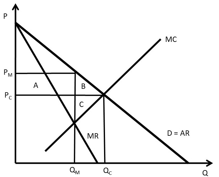
3.5.2 Welfare Effects of Monopoly
The welfare effects of a market or policy change are summarized as, “who is helped, who is hurt, and by how much.” To measure the welfare impact of monopoly, the monopoly outcome is compared with perfect competition. In competition, the price is equal to marginal cost (P = MC), as in Figure 3.14. The competitive price and quantity are Pc and Qc. The monopoly price and quantity are found where marginal revenue equals marginal cost (MR = MC): PM and QM. The graph indicates that the monopoly reduces output from the competitive level in order to increase the price (PM > Pc and QM < Qc). The welfare analysis of a monopoly relative to competition is straightforward.
ΔCS = – AB
ΔPS = +A – C
ΔSW = – BC
DWL = BC
Consumers are losers, and the benefits of monopoly depend on the magnitudes of areas A and C. Since a monopolist faces an inelastic supply curve (no close substitutes), area A is likely to be larger than area C, making the net benefits of monopoly positive.